Visualizing Data
May 21, 2014


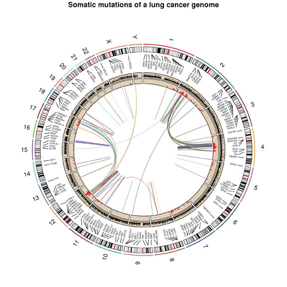
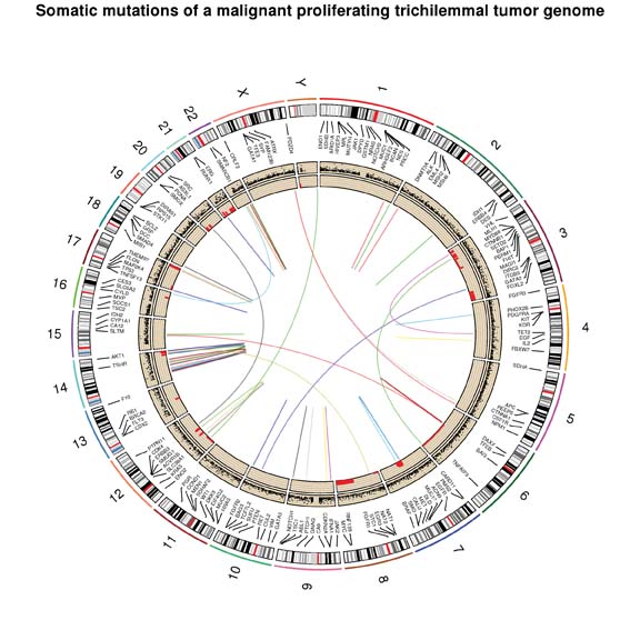
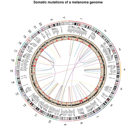
These graphs, called Circos plots, help researchers visualize genomic data. Each plot shows a tumor’s complete genetic sequence. The outer ring represents the genome’s 22 chromosomes plus sex chromosomes X and Y. The middle rings plot where single bases of DNA mutate or where larger sections of DNA are inserted or deleted incorrectly within the same chromosome. The colored lines in the innermost circle show where genes have been rearranged within different chromosomes or between chromosome segments. These Circos plots each represent hundreds of gigabytes of data and months of analysis by a huge team, including clinicians, tissue processors, and research staff in the labs of Zhongming Zhao, Ph.D., M.S., William Pao, M.D., Ph.D., Christine Lovly, M.D., Ph.D., and Kimberly Dahlman, Ph.D.
